
The Date Selection Calendar located in the Scheduler section permits users to define the dates to be displayed in the schedule grid.
The calendar has several features that can assist users in selecting dates to be displayed in the Scheduler grid.
Selecting Months
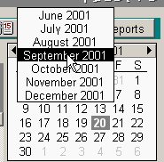
You can change the month displayed in the calendar by either selecting one of the arrows located in the calendar date display bar to change to the previous or next month. You can also click on the Month displayed to popup a selection list of the months available.

Selecting Days to Display in the Scheduler
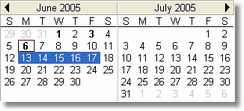
Users can display any day or time period they wish in the Scheduler by simply highlighting the day they wish to view.
For example, by highlighting a week, the Scheduler will display all appointments by day for the week selected. You can also display several weeks or a month at a time by highlighting the dates you wish displayed.

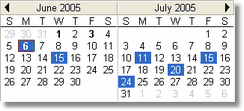
Additional flexibility is provided when using the control key (Ctrl) on the keyboard and selecting specific dates to display.

By holding down the Ctrl key on your keyboard and then selecting specific dates as displayed above, the Scheduler will automatically display the selected days.
The Calendar has a twenty one day (21) limit to the variations you can select for display at one time. You can, for example, display all of the Mondays for a month or display all the first Mondays of each month for a time period in the past or future. We recommend that you experiment with various display options to define which are beneficial to you.
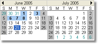
Calendar color coding
The Calendar can display colors that indicate various status for the days displayed
.
Gray Shading: - Indicates that the office is closed
Light Blue Shading - Office open with appointments scheduled
Dark Blue Shading - Selected date(s)
White - Open no appointments
Date in Bold - appointment scheduled for the day
